Choosing the right colours for your home is an important part of creating a space that feels comfortable, welcoming, and visually balanced. The right colour combination can make a room feel brighter and more spacious, highlight architectural features, and create a specific mood.
With so many shades, finishes, and combinations available, choosing colours can sometimes feel overwhelming. Whether you are building a new home or renovating an existing one, understanding a few basic colour principles can help you make confident choices.
https://youtube.com/@divinehouseofficial?si=jRtAqIuH0LOI4BRc
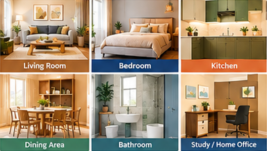
1. Understand the Purpose of Each Room
Every room serves a different purpose, so its colour scheme should reflect how you want the space to feel.
- Living room: Warm neutrals, earthy shades, or soft contrasting colours can create a welcoming atmosphere.
- Bedroom: Soft blues, greens, beige, and muted tones can create a calm environment.
- Kitchen: Whites, creams, greys, and subtle accent colours can give the kitchen a clean and organised appearance.
- Dining area: Warm colours and earthy tones can create a cosy and inviting setting.
- Bathroom: White, beige, light grey, and soft blue shades can create a fresh appearance.
- Study or home office: Neutral colours with subtle greens or blues can create a focused and comfortable space.
Instead of choosing one colour for the entire house, consider how each room connects to the overall design.
2. Consider Natural Light
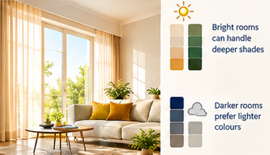
Lighting can significantly change how a colour looks.
A room with plenty of natural light can accommodate a wider range of colours, including deeper shades. Rooms with limited natural light may benefit from lighter colours that reflect more light.
Before finalising a paint colour, observe the room at different times of the day. A colour that looks perfect in the morning may appear different under evening lighting.
3. Follow the 60-30-10 Colour Rule
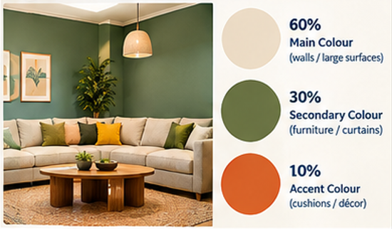
A simple approach to creating a balanced colour scheme is the 60-30-10 rule.
- 60% – Main colour: Walls, large surfaces, or major furniture
- 30% – Secondary colour: Curtains, furniture, cabinetry, or feature elements
- 10% – Accent colour: Cushions, artwork, décor, lighting, or small accessories
For example, you could use warm beige as the dominant colour, wood tones as the secondary colour, and terracotta as an accent.
This approach prevents the room from feeling either too plain or overly colourful.
4. Choose Colours That Work With Your Flooring
Flooring is a major visual element and should be considered before selecting wall colours.
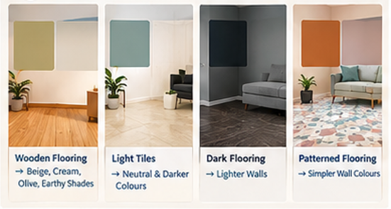
If you have:
- Wooden flooring: Consider beige, cream, olive, warm white, or earthy shades.
- Light-coloured tiles: You have more flexibility with both neutral and darker wall colours.
- Dark flooring: Lighter walls can help maintain visual balance.
- Patterned flooring: Choose simpler wall colours so the room does not look visually crowded.
The goal is to make the flooring and wall colours complement each other rather than compete for attention.
5. Consider Your Furniture and Décor
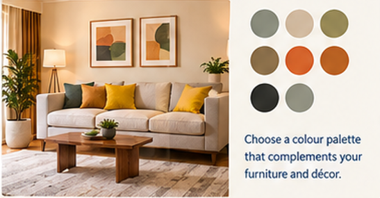
Your furniture should also influence your colour palette.
If your furniture already has bold colours or patterns, neutral walls can create balance. If your furniture is neutral, you can introduce colour through accent walls, artwork, cushions, curtains, or other decorative elements.
For a new home, it is useful to consider the colour palette for walls, furniture, flooring, curtains, and décor together rather than choosing each element separately.
6. Use Accent Colours Carefully
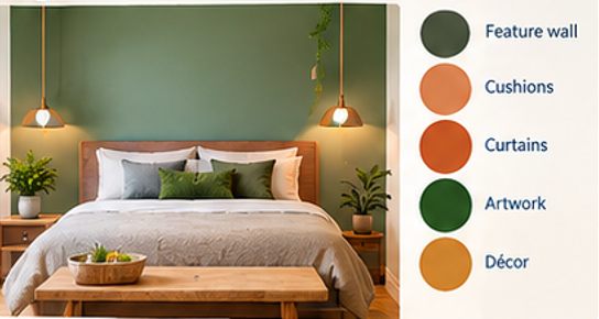
An accent colour can add personality and visual interest to a room.
You can introduce an accent colour through:
- One feature wall
- TV unit or entertainment wall
- Sofa or armchairs
- Curtains
- Cushions
- Artwork
- Decorative lighting
- Cabinet finishes
You don’t necessarily need a strong colour on an entire wall. Sometimes a smaller accent can create the desired effect without overwhelming the space.
7. Think About the Size of the Room
Colour can influence how large or small a room appears.
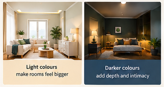
Light colours such as white, cream, light beige, and soft grey can make spaces feel more open and airy.
Darker colours can add depth and create a more intimate atmosphere, but they may make a small room feel visually smaller when used extensively.
For compact rooms, consider using lighter base colours and introducing darker shades through furniture and décor.
8. Create a Consistent Colour Flow
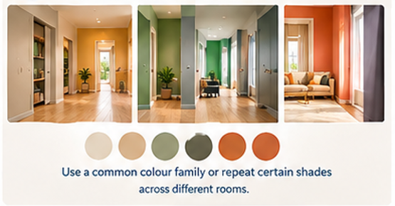
Your home should feel connected from one room to another.
This doesn’t mean every room needs to have the same colour. Instead, choose a common colour family or repeat certain shades throughout the home.
For example, a home could use:
Warm white → Beige → Wood → Olive green → Terracotta
Repeating these tones in different rooms creates a cohesive interior while still allowing each space to have its own personality.
9. Consider the Exterior Colour Combination
Colour selection isn’t limited to interiors. The exterior colour scheme plays an important role in your home’s overall appearance.
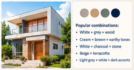
Popular exterior combinations can include:
- White + grey + wood
- Cream + brown + earthy tones
- White + charcoal + natural stone
- Beige + terracotta
- Light grey + white + dark accents
When choosing exterior colours, consider the elevation design, balcony railings, doors, windows, stone or tile finishes, and surrounding environment.
10. Don’t Ignore Artificial Lighting
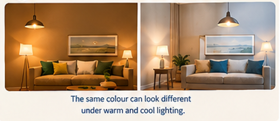
Artificial lighting can change the appearance of paint colours significantly.
Warm lighting can make beige, cream, brown, and terracotta shades appear warmer. Cooler lighting can make whites and greys appear sharper.
Therefore, test your chosen colour under the actual type of lighting you plan to use before painting the entire room.
11. Use the Colour Wheel for Inspiration
The colour wheel can help you understand how different colours work together.
Some common combinations include:
Monochromatic
Different shades of the same colour create a simple and sophisticated appearance.
Complementary
Colours opposite each other on the colour wheel create stronger contrast.
Analogous
Colours located next to each other create a harmonious and natural combination.
For homeowners who prefer a simple look, neutral and monochromatic palettes can be easier to maintain.

12. Always Test Before Finalising
Never select a wall colour based only on a small colour card.
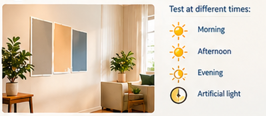
Paint a sample on the wall and observe it under:
- Morning light
- Afternoon light
- Evening light
- Artificial lighting
Also check how it looks alongside your flooring, furniture, doors, and other finishes.
A small sample test can help you avoid costly repainting later.
Popular Colour Combinations for Modern Indian Homes
Here are some combinations that can work across different interior styles:
| Main Colour | Secondary Colour | Accent |
|---|---|---|
| Warm White | Natural Wood | Olive Green |
| Beige | Cream | Terracotta |
| Light Grey | White | Charcoal |
| Soft Blue | White | Natural Wood |
| Cream | Brown | Gold |
| Sage Green | Warm White | Wooden Finish |
| Greige | Beige | Black |
These combinations can be adjusted depending on the size, lighting, furniture, and architectural style of your home.
Common Colour Selection Mistakes to Avoid

Using Too Many Colours
Too many unrelated colours can make a home feel visually cluttered.
Choosing Colours Only From Trends
Trends change over time. Consider whether the colour will work with your home and personal preferences for years to come.
Ignoring Lighting
The same shade can look completely different under natural and artificial light.
Forgetting Existing Finishes
Wall colours should complement flooring, furniture, doors, countertops, and other permanent finishes.
Choosing Colours Without Testing
Always test paint samples before making a final decision.
Final Thoughts
Choosing the right colour combination is about more than simply picking your favourite shades. It involves considering lighting, room size, furniture, flooring, architecture, and the overall mood you want to create.
A well-planned colour palette can bring together your home’s architecture and interiors while creating spaces that feel balanced and comfortable.
Choose colours that complement your home, reflect your style, and make every space feel like your own.
1. How do I choose the right colour combination for my home?
Consider the room’s size, natural light, furniture, flooring, and the mood you want to create. Start with a main colour and add complementary secondary and accent colours.
2. Which colours make a home look bigger?
Light shades such as white, cream, beige, pastel blue, and light grey can make rooms feel more open and spacious by reflecting more light.
3. How many colours should I use in one room?
A simple approach is to use 2–3 main colours and introduce additional shades through small décor elements. The 60-30-10 rule can also help create a balanced colour scheme.
4. What is the 60-30-10 colour rule?
The 60-30-10 rule suggests using approximately 60% of a dominant colour, 30% of a secondary colour, and 10% of an accent colour to create visual balance.
5. Which colours are suitable for a living room?
Warm white, beige, cream, light grey, earthy tones, and subtle accent colours can work well in living rooms. The choice should also complement the furniture and lighting.
6. What are the best colours for bedrooms?
Soft and calming shades such as light blue, sage green, beige, cream, and muted neutral tones can create a relaxed bedroom atmosphere.
7. How does lighting affect paint colours?
Natural and artificial lighting can change how a colour appears. A shade may look lighter, darker, warmer, or cooler depending on the type and amount of light in the room.
8. Should wall colours match the flooring?
They don’t have to match exactly, but the colours should complement each other. Consider the flooring’s tone and pattern when selecting wall colours.
9. Should the entire house have the same colour combination?
Not necessarily. Different rooms can have different colour schemes while sharing a few common tones to create a consistent flow throughout the home.
10. How can I choose colours for a small room?
Use lighter base colours to create an airy appearance and add darker or brighter shades through furniture, artwork, cushions, or a small accent area.
11. How do I choose an exterior colour combination for my house?
Consider the home’s elevation, architectural style, roofing, doors, windows, stone or tile finishes, and surrounding environment. Neutral shades combined with one or two accent colours can create a balanced exterior.
12. Should I test a paint colour before painting the whole room?
Yes. Paint a small sample area and observe it at different times of the day and under artificial lighting before finalising the colour.
13. What are some popular colour combinations for modern homes?
Popular combinations include warm white and natural wood, beige and terracotta, light grey and charcoal, sage green and warm white, and cream with brown accents.
14. Can dark colours be used in small rooms?
Yes. Dark colours can add depth and character, but using them selectively—such as on an accent wall or through décor—can help maintain visual balance.
15. How can I make my home’s colour scheme look cohesive?
Choose a consistent colour palette and repeat selected shades across different rooms through walls, furniture, curtains, flooring, artwork, and décor.